Car2Cart
Designing a grocery ride-share concept around student access, affordability, and trust
Car2Cart · Cornell HCI project
UX research & interface design
Background
For Cornell's INFO 3450: Human-Computer Interaction capstone, our team explored a practical barrier to food access: students without cars often had limited, time-consuming ways to reach affordable grocery stores. We designed Car2Cart as a ride-sharing concept that could connect students making similar trips while accounting for budget, dietary needs, timing, and trust.
I worked across research and interface design, including interview and testing plans, facilitation and note-taking, affinity mapping, personas, paper prototypes, heuristic evaluation, Balsamiq wireframes, and Figma prototypes. Each round produced specific changes rather than serving as a checklist of methods.
The Final Product
The HCI Design Cycle
We moved through four connected phases—understanding, designing, implementing, and evaluating—then returned to the prototype with findings from usability testing. The project was time-boxed to one substantial iteration, so the case study focuses on what we learned and what changed between versions.
0. Project Definition
Problem statement
Cornell students without cars had limited access to affordable grocery stores. Bus travel could turn a routine shopping trip into a long commitment, while delivery and commercial ride-share fees undermined the savings students were seeking.
Proposed solution
Car2Cart would help Cornell students coordinate grocery trips with peers already driving to local stores. Riders gain a more practical route to affordable food, while drivers can share available seats and receive a small contribution toward the trip.
1. Understand Users
Research goal
We wanted to understand how cost, transportation, schedules, dietary needs, and available information shaped students' food decisions—and where an interface could address a genuine access problem.
Participants
We recruited undergraduate students with different experiences of food access through peer referrals and a campus Facebook post.
Sample interview questions
- Do you follow a meal budget?
- What makes you want to cook more vs. eat out more?
- Can you describe a normal (breakfast/ lunch/ dinner) meal for you on a school day?
- Are you able to eat your favorite food on campus often?
- Do you pay attention to making healthy choices when you're buying food?
- Is transportation a factor affecting you to get certain food?
- Do you have any dietary restrictions that prevents you from eating certain foods?
- Do you feel informed about the food options on campus?
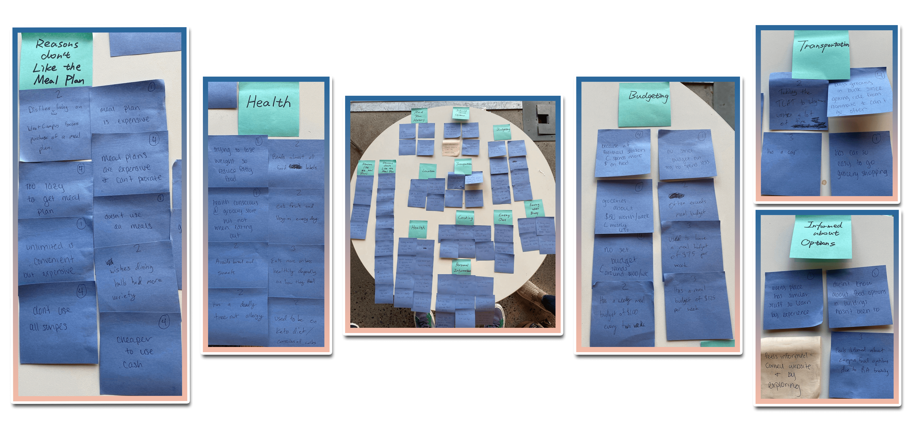
Affinity Diagram
Meal-plan fit
Students described paying for meal swipes they could not always use and missing scheduled meals because of work or other commitments. Buying groceries could cost less, but only when transportation was practical.
Information was highly local
Participants knew the options near their regular routes but were less aware of food available elsewhere on campus.
Health
"I was hospitalized earlier by an incident at the dining hall in which a dessert item was cross contaminated with nuts, and was mislabeled when put out for consumption."
"I'm conscious of most food labels and most sweets and breads are risky for me."
Transportation constrained cooking
Students without cars described grocery trips by bus as long and difficult, especially when carrying purchases home.
Budgets were not always formal
Several participants made cost-sensitive decisions without maintaining a fixed meal budget, so the experience needed to communicate trip costs plainly.
We synthesized the research into a persona that kept the team's design decisions grounded in a consistent set of needs and constraints.
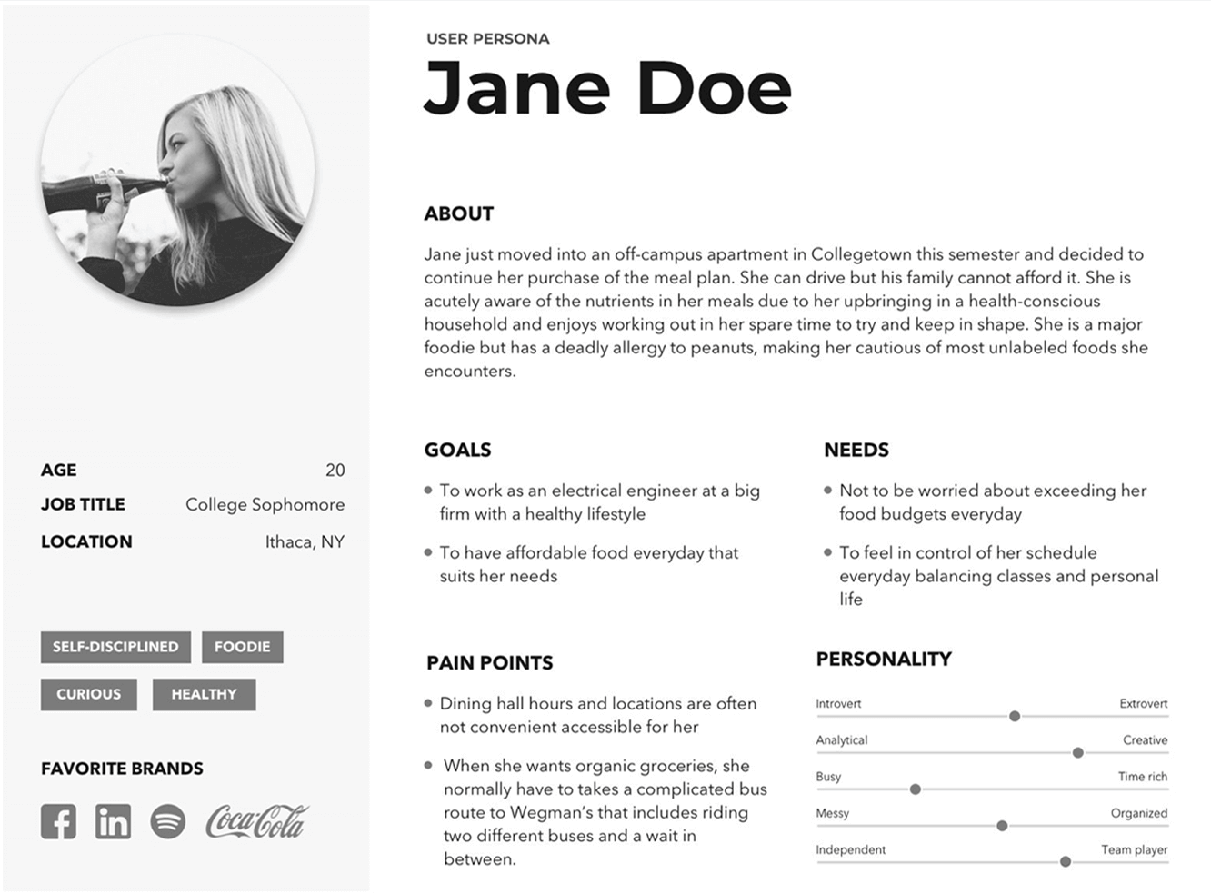
This graphic, created by teammate Yaoyao, shows an overview of the persona we used as an axis for design. In our initial creation of this persona, we defined life, experience, and end goals, as well as behavioral context for actions this persona would take on any given day.
Functional and Contextual Requirements
Transportation — Connect people with short-distance rides to local grocery stores
Description: Users can schedule rides by entering details such as time and destination, then matching with other students already driving to local grocery stores.
Rationale: Our research showed that students who wanted affordable, healthy groceries often could not reach them efficiently because of limited transportation options and long bus trips.
Location — A student can only walk so far with groceries
Description: Many students live on or near campus, so grocery options outside walking distance require reliable transportation both to the store and back home.
Rationale: Simply listing grocery stores across Ithaca would not solve the problem for students without a practical way to carry groceries home.
Device and Platform — Support users while they are moving
Description: The service should work on a mobile platform so users can search for rides, communicate, and check trip status while away from a computer.
Rationale: Every participant owned and frequently used a smartphone, making mobile the most useful and accessible platform for the service.
2. Design
Market research
We compared campus food-information tools, grocery planning and delivery products, navigation services, and ride-share apps to identify which parts of the problem were already covered.
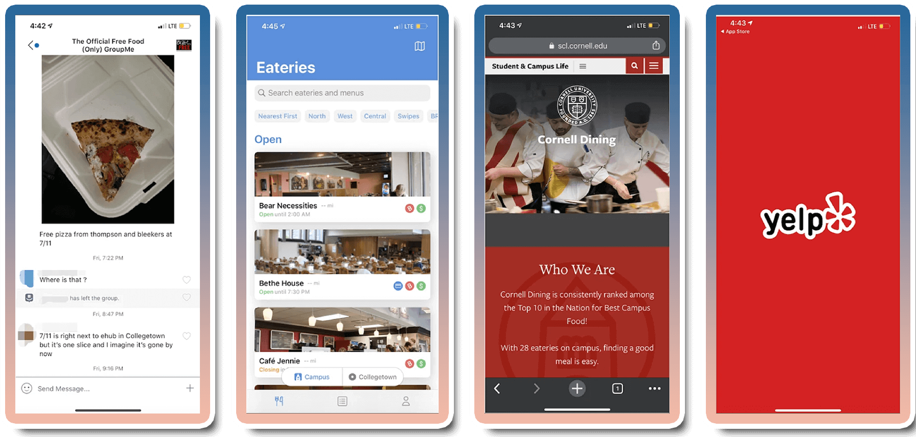
Campus tools such as Eatery and Cornell Dining helped students discover food, while shopping and delivery products supported lists or brought groceries to a customer. Navigation and ride-share apps could show a route or provide a car, but recurring fees made them a weak answer for cost-sensitive grocery trips.
The gap was coordination: none of the products we reviewed connected students who needed groceries with peers already making the same round trip. That distinction shaped Car2Cart around shared plans rather than on-demand commercial rides.
The opportunity was direct, affordable transportation to and from grocery stores.
Initial design intention
Drivers would post a store, departure time, and available seats. Riders would search by destination and timing, review the trip details, and coordinate with the driver. The concept focused narrowly on grocery access so the experience could address the cost, return-trip, storage, and trust questions that a generic ride-share flow would miss.
Paper prototype and storyboarding
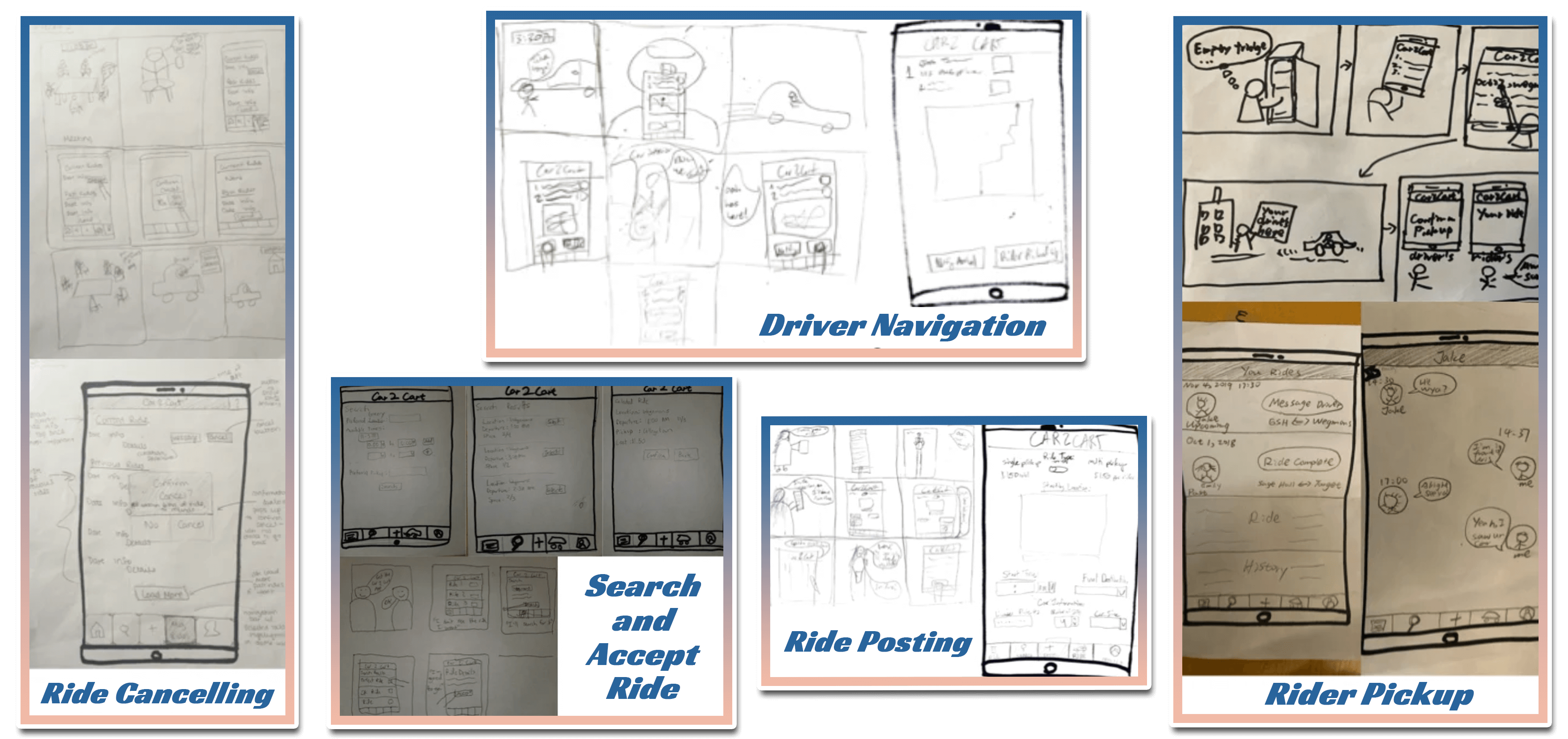
We tested the paper flow with four prospective users. A facilitator presented tasks, a note-taker recorded behavior, and a “Wizard of Oz” operator changed the paper interface in response to each action.
What needed to change
- Clearly label navigation icons.
- Include more specific ride information such as the vehicle used.
- Clarify the intention for some text-based form elements.
Paper Prototype Walkthrough Video:
Watch our team walk through the paper prototype, demonstrating the intended user flow and key features of the Car2Cart app.
3. Implement
Balsamiq prototype
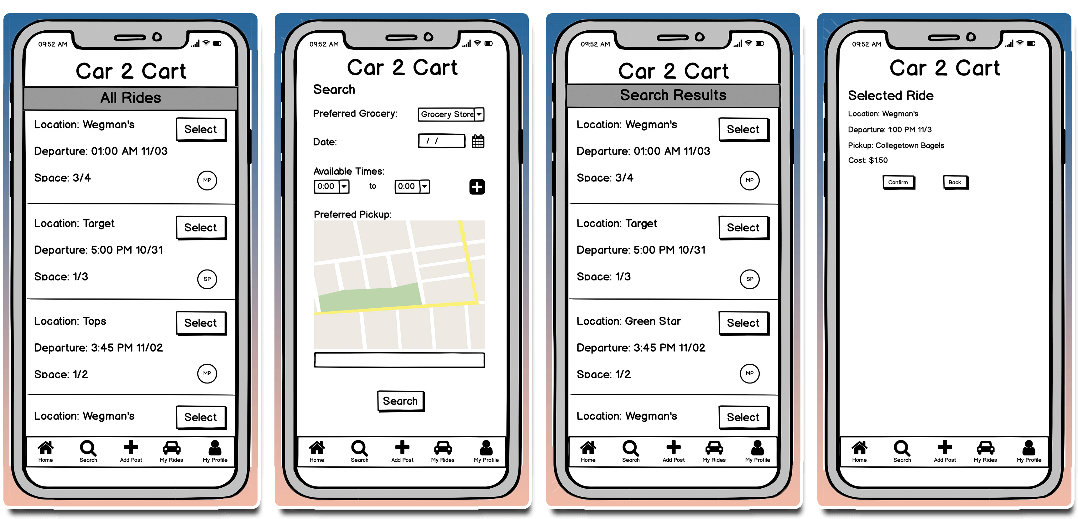
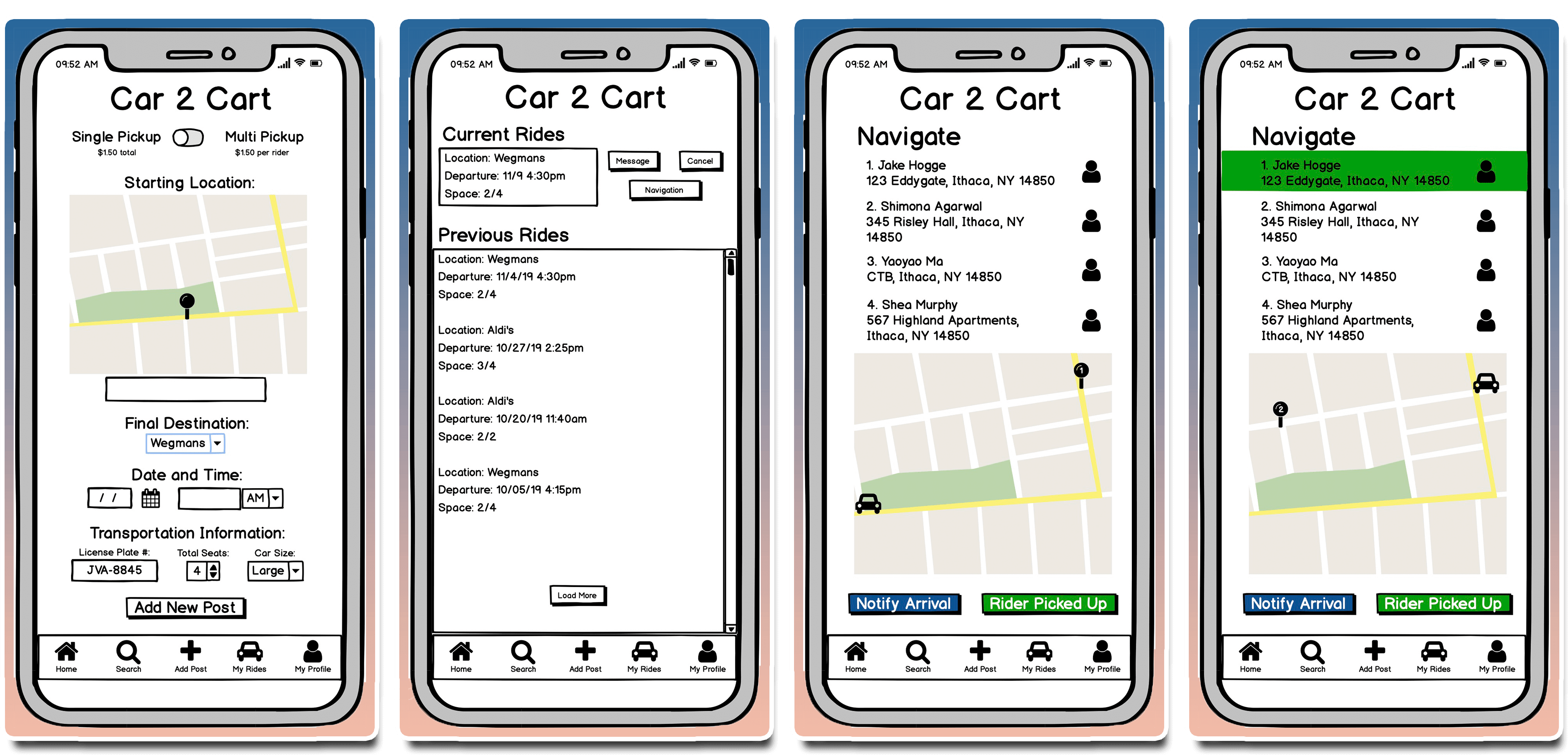
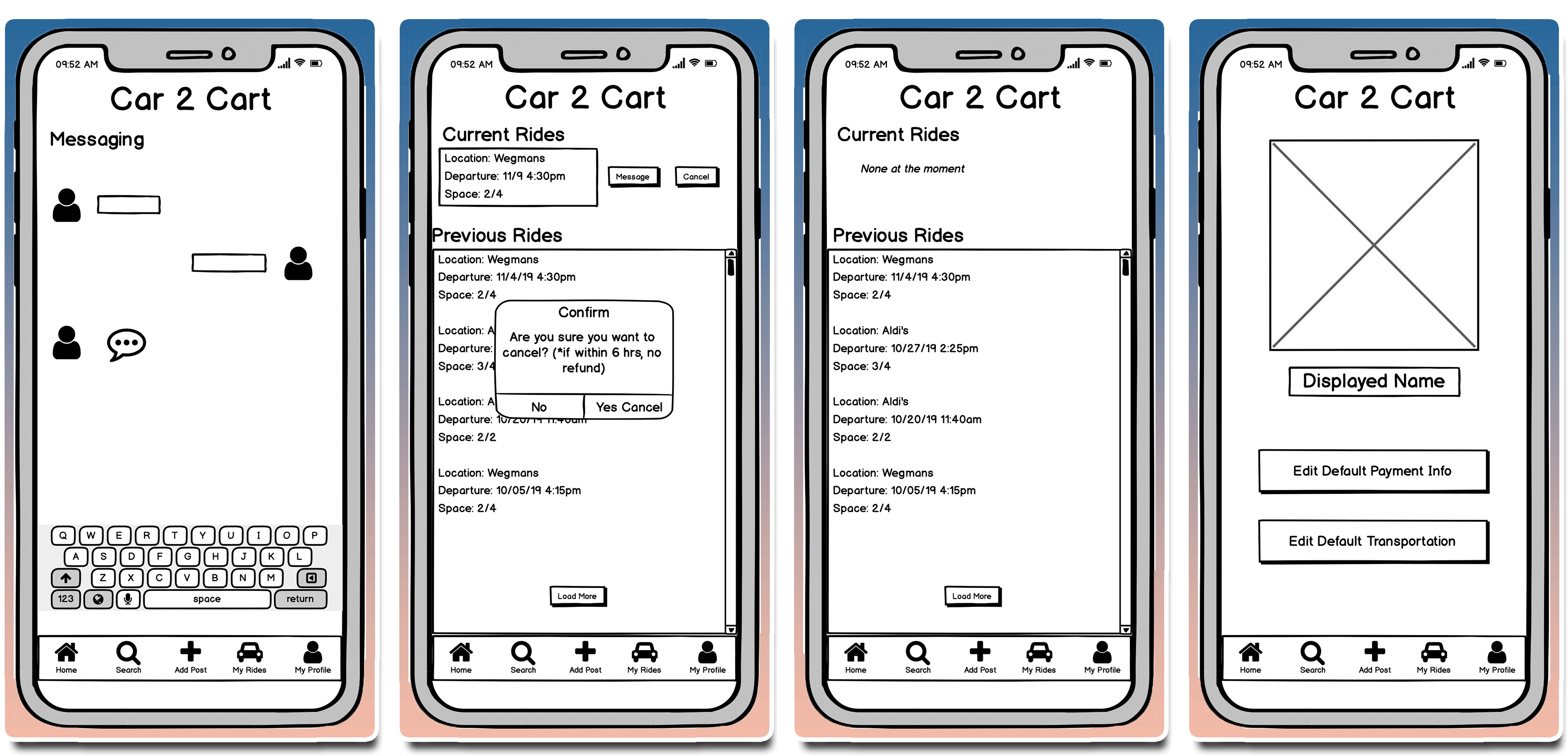
The mid-fidelity prototype added labels to navigation, clarified ride and vehicle details, and gave form controls more explicit intent. It also let us test the sequence as one connected experience rather than a collection of paper screens.
Home, Search and Confirm Ride
Post Ride, Current Ride Status, and Navigation
Messaging, Cancelling Ride, and Profile
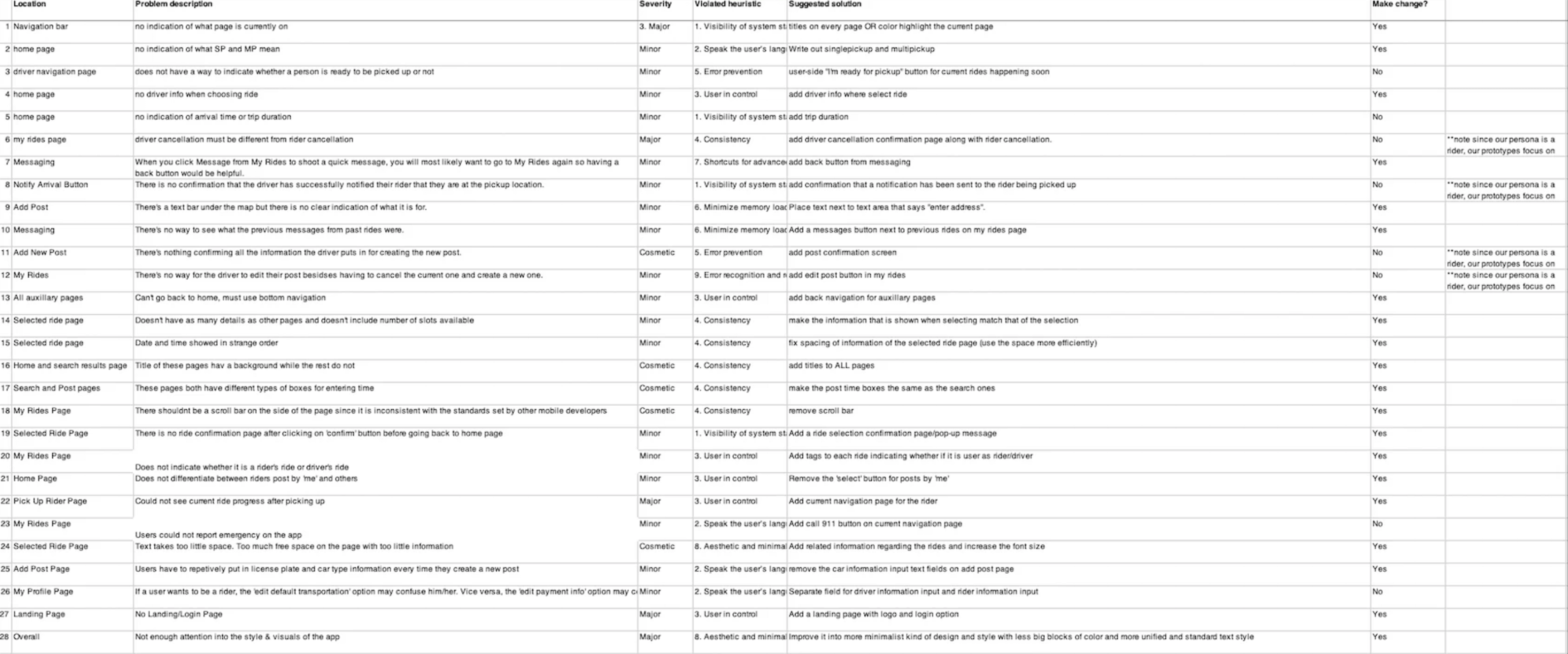
Heuristic Evaluation:
Initial Figma Prototype:
4. Evaluate
Usability Testing:
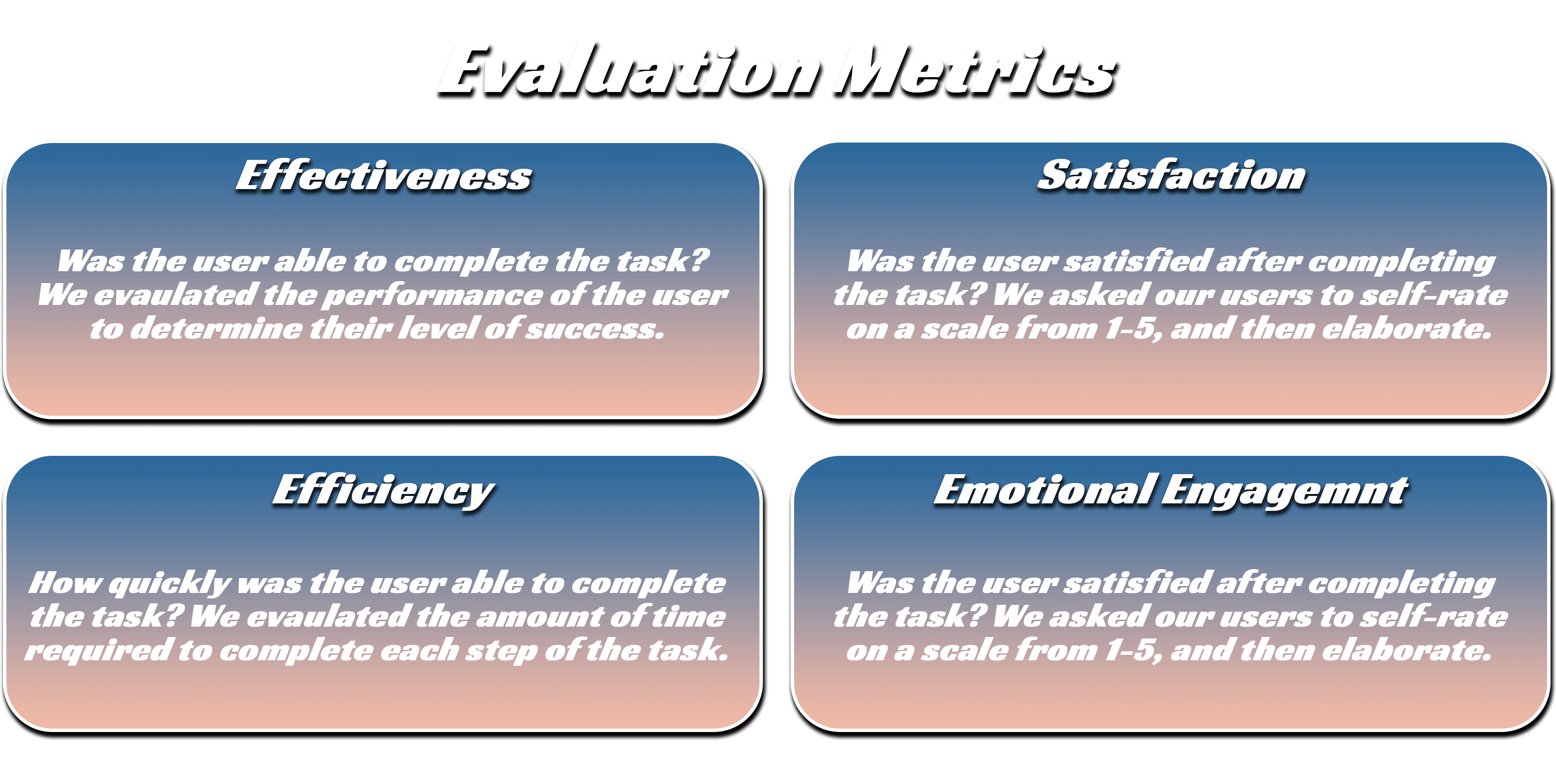
After conducting usability testing sessions with 4 different users, we found:
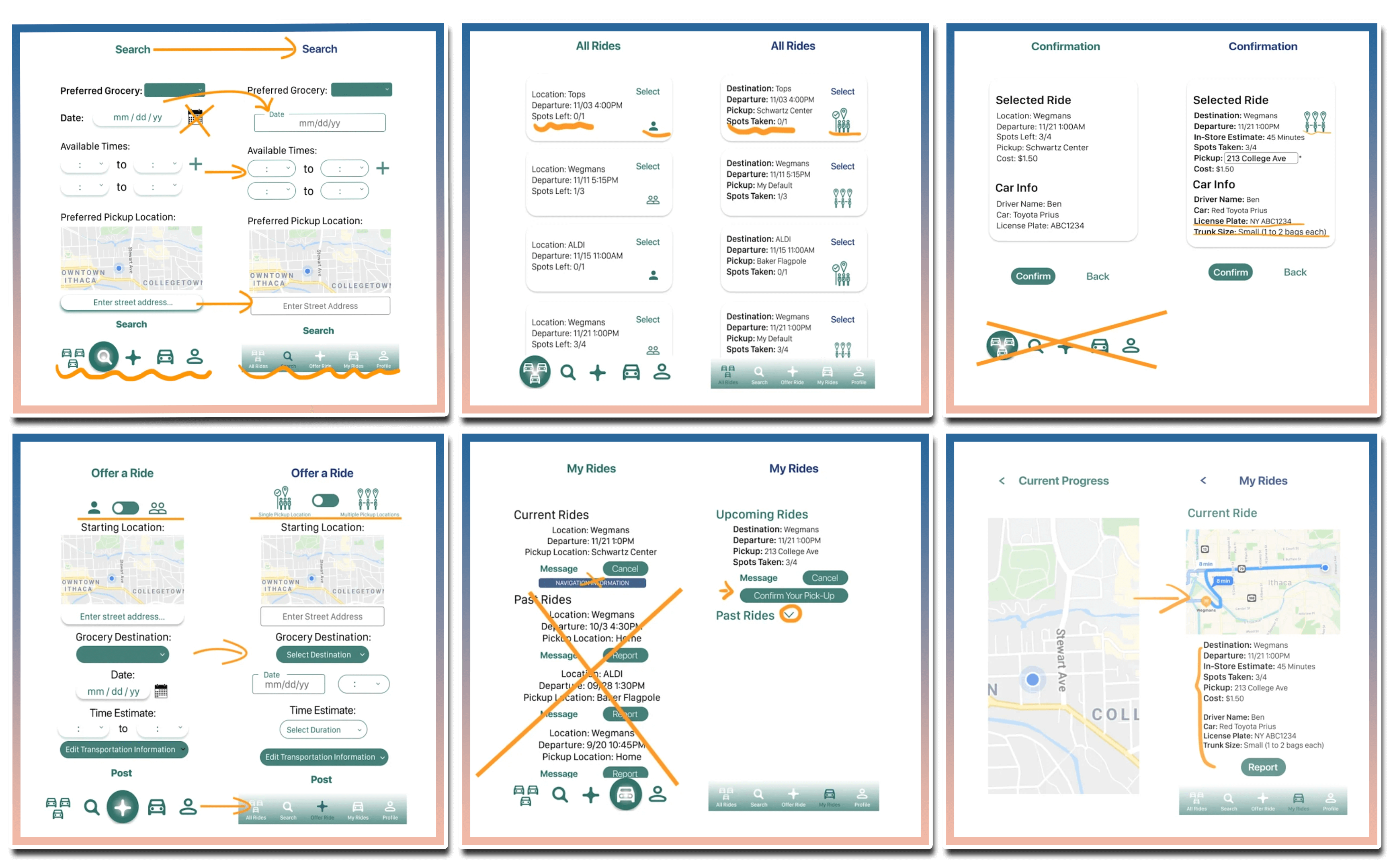
- Navigation icons are difficult to understand, especially with no labeling.
- Single and Multi Pickup icons are difficult to understand.
- My Rides Page is cluttered with extraneous information from past rides and could also include a map for the current ride.
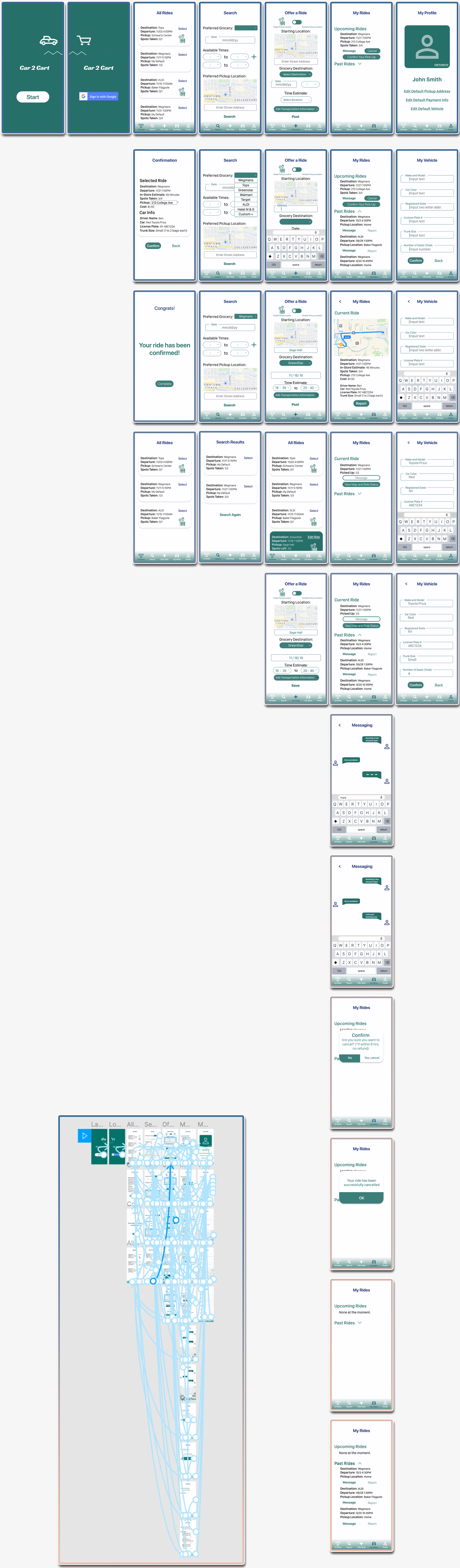
5. Return to Implement
Presenting the concept
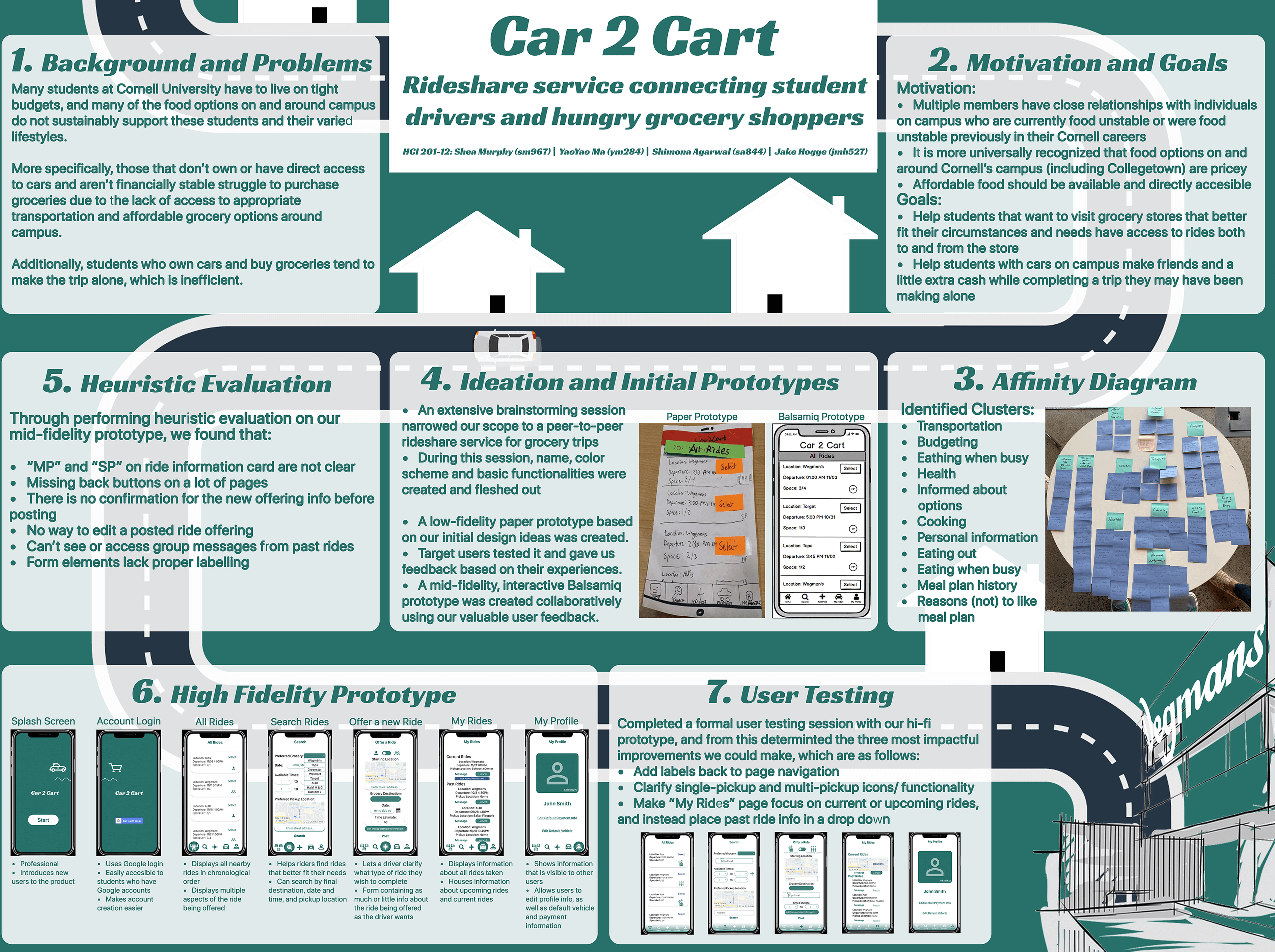
Poster used in final presentation. Designed by me.
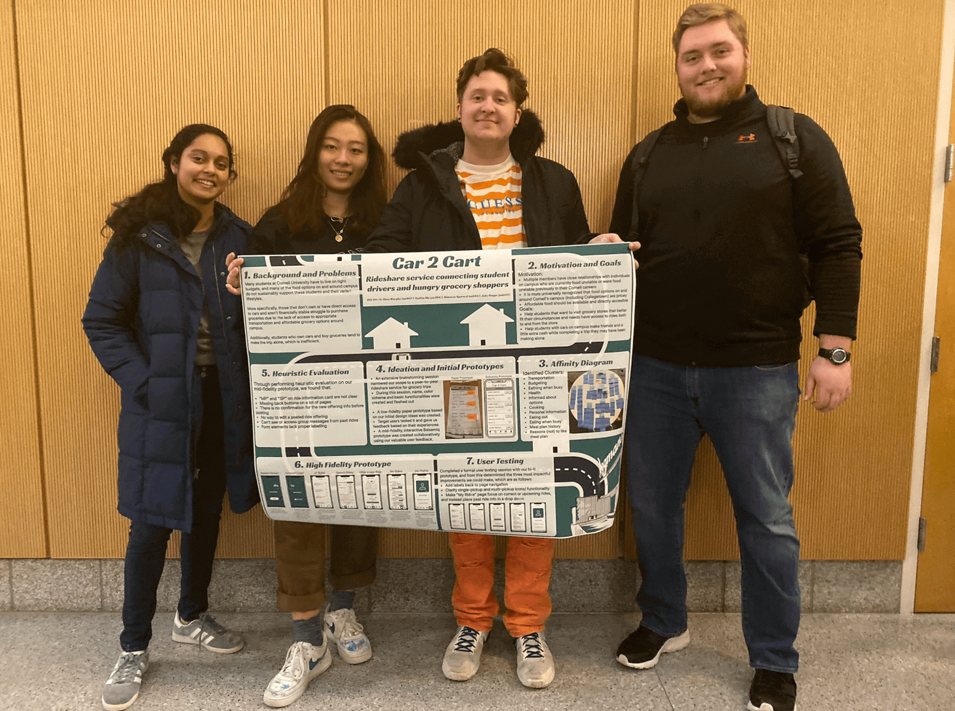
Team pictured from left to right: Shimona, Yaoyao, myself and Jake.
This project shaped how I think about UX design. Read about my overall approach to user experience research and design.